Here I have a couple of before and after shots that I took today. Ok so I'm not so great with the camera, but I sure do have fun with it. I find myself taking pictures of some of the strangest things sometimes though. And it really gets annoying everytime I try to take a picture of something living, whatever it is, if it's alive, it knows when I'm getting my camera, and it takes off.
Oh sorry, back to the point of my post. Like I said, before and after. The picture of the bird I took through the front window. It didn't look too bad but it was kind of on the dull side. The picture of the dog is a little on the blue side and it's not because he's an unhappy puppy...lol. I actually used the manual setting on my camera when I took that one and I think I had the white balance set on the wrong thing. I don't know, when it comes to all the technical stuff on my camera I'm still a little brain dead.

So how do we fix these problems? Actually it's only going to take a couple of clicks. For the bird picture all I did was adjust the levels. On the picture of the dog I did the same thing but also removed the color cast.
If you aren't familiar with either one of these I have a quick and easy explanation.
First to remove a color cast. In pse you go to enhance > adjust color > remove color cast. A window will pop up and tell you to click on something in the picture that is supposed to be either white, gray or black. After you do that click OK and just like magic, no more blue color cast.
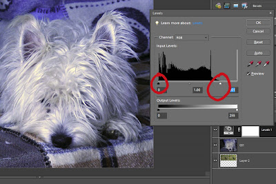
Now for the levels. Click on your picture in the layers palette. Now click on the adjustment layer icon and select levels. A window will come up like in the picture below. You'll see I circled the black and white pointers under the histogram. What you want to do is slide each of those over just to where the histogram starts to rise on either side. So you would move the black pointer to the right and the white pointer to the left. Actually in this case the black pointer was fine it was just the white one that needed to be moved to the left (notice where I moved it to). You may also want to slide the middle pointer either way to see what changes that makes. Play around with it until you get something that you like.

And there you have it. Quick and easy and your pictures now look fabulous.

No comments:
Post a Comment