Sunday, November 30, 2008

What in the world

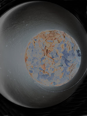
Perhaps it's just my bored, imaginative eye, but I think that this picture resembles a small part of the universe. Earth is standing out in front with another planet looming behind. Beyond that you see the blackness of an infinate universe.

You may be wondering at this point if I've lost my mind. Or maybe you're in awe of my outstanding photographic skills. Another possability could be that you're questioning how I did this.

Well, no, I haven't lost my mind, yet. I may be a little on the looney side sometimes but for the most part I am still in posession of all, if not most, of my marbles. If you were thinking this was a stunning work of photography, I thank you for the compliment, but alas, this was merely a picture taken in a moment of shere boredom. I held the camera over the top of an open can of fish food....LOL (ok so maybe when I did that I was temporarily a candidate for the nut house)

Here's how the whole thing started.
As I said I took a picture from the top of the fish food can. (I really can't believe I'm admitting to this)


-I opened up this picture in photoshop elements 5.
-Duplicated the layer (Layer > duplicate)
-Turned the duplicate layer to black and white (enhance > convert to black and white >urban snapshot)
-changed the blending mode of the black and white layer to exclusion
-I then used the eliptical marquee tool to make a large oval selection.
-I chose select > feather using a value of 200 then select > select inverse
-before filling this selection I created a new layer. On the new layer I right clicked and chose fill selection and chose white for the fill color.
-I changed the vignette layers blending mode to color
-At this point it pretty much looked like the final image except for the corners still had too much white in them so I used the clone tool to carry the black all the way to the edges. (You may be thinking that it would have been easier to just add a black vignette instead of white. It does sound like a better option. However I did try it that way and didn't get quite the same look as I did with the white)

I hope you enjoyed my pictures and mini tutorial. Maybe it even inspired you to take your own boredom pictures to see what you can come up with.

Saturday, November 29, 2008

Stop and have a cup of tea

Some time ago I was introduced to the art of tea bag folding. If you aren't familiar with it, you fold squares of paper and then join them to make medallions. (to learn more you can check out this site http://www.cardsandcrafts.freeservers.com/teabaginst.html ) For a while I was printing out tea bag tiles by the dozens, cutting them out, learning different folds and then using them to make greeting cards. Eventually I moved on to a new creative outlet and the teabags were retired to the craft drawer. That is until the other day, when I got the idea to scan them and use them for scrap booking

This is one of the medallions I rescued from my craft stash


After I scanned and extracted this one it led to 3 more, followed by some related embellishments, and before I knew it I had a whole kit put together. For lack of a better name I simply called it "Tea Time"

The kit includes:
16 papers
1 alpha set (upper case only)
28 embellishments which include
-2 borders (1 tiled and one punched)
-4 bows
-4 buttons
-1 envelope
-1 journal
-1 note paper
-3 paper clips
-1 photo mat
-1 pen
-1 raffia button bow (ready to add on top of a button)
-1 swirly
-1 tea bag
-1 tea cup
-4 tea bag medallions
-1 tea bag tile
-1 word art


So are you dieing to see what it looks like yet? Well then, without further adieu, I present to you, "Tea Time" I loved the combination of warm dark colors blended with the softer pinks.


Now, I could either pour you another cup of tea or you can click HERE to get the download. Stop by again sometime and maybe we'll have coffee.

Monday, November 24, 2008

Bah Humbug and a freebie

Bah Humbug is exactly the way I'm feeling about Christmas right now. Don't get me wrong, I love Christmas. What I'm really disliking right now is what it's turned into. Retailers rushing the holidays through so they can get bigger sales every year, shoppers fighting to be the first one to get the years hottest toy, the mentality that tells people if your really want to show your love and appreciation you have to spend, spend spend (whether you have the money to spend or not).
You could say I'm guilty of rushing the season myself, since I've already posted some Christmas freebies here, and you would be right. I'm also guilty of over indulging my children when they were younger. After so many years of it, and my holiday spirit taking longer to kick in, it's time for me to ignore the unrealistic expectations and focus more on what it's really all about.

I sat down tonight and created some word art that was based on the true meaning of Christmas.


To get the freebie click here

Sunday, November 23, 2008

Sunday part 4 (a freebie)

My final post for today is a freebie. It's called "Tis the season"
It includes 8 papers and 13 elements. I was going to include an alpha set as well but I've discovered that I am not a fan of making alphas. If anyone knows of a quick and easy way to do them, please share your secrets. Enjoy the kit, and I would love to see how you use it. Send me an email or a link to what you've created.


to download click here

Sunday part 3 (a photo edit)

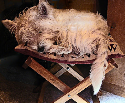
I started out with this picture. Composition wise, I would say it's not so bad. I could be wrong, but I think it follows the rule of thirds. Photographically speaking, it's not so good. I onlyl have a point and shoot camera, no external flash and no special lighting. Therefore, it was in need of a little Photoshop elements magic.


Here is what I did to get the results you will see below.
1. Open the picture and run the auto smart fix (enhance > auto smart fix) . In addition I also ran the auto levels and contrast.
2. Adjust Hue/Saturation (enhance > adjust color > hue/saturation) This picture obviously had too much red in it to me so I chose to adjust just the reds first. Then since it was taken inside under an incandescent light it had that yellowish tint so I also lowered the yellows.
3. Unsharp mask (enhance > unsharp mask) the settings I used were amount: 14, radius: 40, threshold: 0
4. Duplicate layer and convert to black and white (enhance > convert to black and white) My version of pse gives options when you select this. I chose the urban snapshot.
5. Duplicate black and white layer and then go to filter > other > highpass. I chose a radius of 7 pixels.
6. Change the blending mode to hard mix and the opacity to 40 and merge down.
7. Change the blending mode of the top layer to luminosity and merge down.


Ahh I like this much better than the original. But, I'm still not quite happy with it. I don't care for the bottom right corner. It's too light in comparison to the rest of the picture. A few more adjustments here.
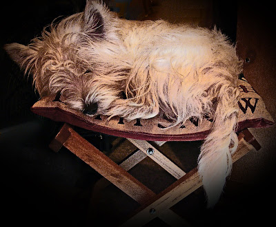
1. select the elliptical marquee tool. I made a large selection over the picture so that just the 4 corners would be affected.
2. Select > Feather and chose a radius of 200
3. Select > inverse
4. create a new layer then right click the mouse and choose fill layer > black. At this point you can adjust the opacity of this layer if you want or leave it as is and merge down.


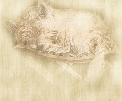
I was very satisfied with the way this looked but felt like doing just a little bit of experimenting. I took a background paper that I had created for a scrap book kit and placed it on a layer beneath the edit. Then I played around with the blending modes. Then I placed a copy of the background paper above the edit and with a soft edge eraser and the opacity turned down to around 25 I erased the inside so that the dog would show through and finally messed around with the blending mode until I got a look that I was happy with.

And VOILA. Here is my masterpiece.

Sunday part 2 (playing with light)

Some time ago I had seen pictures that someone had taken in the dark using lights. By moving either your camera or the light source you can get some really cool effects. Last night I decided to give it a try. I turned off all of the lights except for some Christmas type lights. I set my camera on the "night" setting and then moved the camera around in different directions while taking the picture. Another way to do it would also be to put your camera on a tripod, use the timer and then you have your hands free to move the light source.


This isn't something that I would hang on my wall but it was fun. Next I think I'll try doing it with the camera on the tripod and see what I come up with that way. Go ahead, give it a try.

Sunday part 1

Yep, that's right, part 1. I have several different things I want to share with you today and I thought it would be best if I broke it down into separate posts.


I came across a website today that I found so entertaining. I'm sure that I could have wasted the afternoon away playing here. You have got to check this one out. Especially if you do any kind of photo editing or scrap booking. The website is BGPatterns I'm not sure about terms of use for any of the patterns you create. They didn't have anything on the website as far as FAQ or TOU.

Here are a few of the patterns I made while I was there.


Head on over there and make some of your own. When you register you can save all your patterns right there on the site. You can also download them to your computer.

Saturday, November 22, 2008

A couple of LO to share

Here are a couple of layouts I did last night.
This one is just a few pictures from my daughters cooking baking night last weekend


And this one is the bridge that I had written a post about not too long ago. I didn't take the pictures. A friend emailed them to me and I thought they would make a good scrap book page.


There's a reason cameras have different settings

And that reason is so that you can get better pictures. Yes it is as simple as that. With other cameras I have had, I never would have thought to have done anything else other than to turn the camera on, focus and press the shutter button. Since my intense fascination for photography began about a year ago I began to explore the features that are available on my camera. I may not always get breathtaking results but I do discover, from time to time, that changing the setting on the camera to suit the subject can produce a better picture. Here is an example of what changing the setting can do.
This picture was taken with the auto setting. Notice the bluish tint in the snow?
My camera has a setting specifically for taking pictures of snow. I changed it to that for this next one and you'll notice that the snow doesn't look so blue now.
To get the best results from your digital photos the best thing to do would be to learn how to use the full manual setting. But if you're like me, using a point and shoot camera, and not quite able to get great results, at least check out all the possibilities that your camera has to offer you.

Wednesday, November 19, 2008

In search of inspiration

I went on a mission in search of inspiration earlier today because I've felt like I've been in a creative slump lately. I have made numerous attempts at editing several pictures and just couldn't come up with anything that grabbed me. Normally, when I do an edit, I don't consider it DONE until I can look at it and say "Now that, I like" The last few days the only words coming out of my mouth while I'm working on something are "Nahh, Ehhh, or simply a big sigh" There have been several new scrapbooking projects also that have fell victim to the delete key. My best friends seems to have become Control Z a.k.a. Undo.


So on my voyage I found several interesting web sites that I wanted to share. The first one is http://www.wordle.net/ You can either type in several different words or insert a link and it creates a word cloud. This is one I did by entering the URL for my blog. You can print them out when you're finished. I tried saving the picture to my computer but the resolution is too small for it to be readable. But I thought it was really cool. It's fun to play with anyway.
Another website I found was http://www.jessicasprague.com/ She has quite a few tutorials that I plan on going back and looking at some more. They are all categorized into photo editing, type, ps brushes, drawing and patterned papers and general ps tips.


This one I've known about for awhile but it's worth sharing. http://www.colourlovers.com/ Before I found this site, I just picked colors randomly when doing a scrapbook page. After going to colourlovers and picking out a color palette I was much happier with the way things turned out. It makes a big difference when you have the right color combinations. No guessing on which colors to put together to get the best look.


The final thing I have to share with you today is a freebie. I was just playing around and came up with 12 Christmas theme doodles. I think my favorite one is the cat.


to get the freebie click here

Sunday, November 16, 2008

Fun, Photos and a Freebie

My daughter, Amanda came over yesterday and we did a little shopping then she made us lasagna for dinner and used my kitchen to bake a HUGE batch of chocolate chip cookies


When we got back from shopping and were carrying the bags into the house she pointed out the sky. It had been raining really hard while we were out and by the time we got back home the rain had stopped and the sky was so pretty. I just had to run in and get my camera. Of course I did some quit edits on them too. Mainly just adjusting levels. The second and third one I also added a frame to. (as if this wasn't going to be obvious to you...lol)


My shopping for the day consisted mainly of things for the dog. I snapped a picture of him sporting his new sweater and playing with one of his new toys. (He's so spoiled)
Ok, so you've seen the Fun
You looked at the photos
Now you get the freebie

This is just a small one. A few Christmas light bulbs that I made the other day. There are 4 colored ones and one grey scale if you prefer to add your own color.
If clicking the preview doesn't work you can also click here


Friday, November 14, 2008

This one just sort of snowballed

I set out to make some doodles the other night and before you know it I ended up with something completely different. It started with a blank snowman, then the eyes, nose, mouth and stick arms. After that I had to dress him (no self respecting snowman would stand out in the cold without his hat and scarf) Before you know it I was adding papers, word art, and some other little goodies. Before I created a blizzard in my computer room I thought I would end it here and offer it to all of you.


you can get him by clicking the preview or here
The funny looking snowman in the upper corner with the hole in the middle of his face is so that you can put your own face in there if you want.
I wasn't sure about putting this up for a freebie or not, especially after looking at what my talented sister just made but I remembered my quote from a few days ago and went for it.
Check out my sister, she's awesome http://www.prettypixelsct.blogspot.com/

Tuesday, November 11, 2008

A gift

Short and to the point today. A gift for all of you "Angels" who stop by and read my blog.


the background paper is not included. Just the angels all in png format. To download you can click here
Enjoy everyone

Monday, November 10, 2008

Macro

I just love the macro setting on my camera. Until I got the camera I have now, which is a Fujifilm Finepix S700, I never knew what macro was. Once I discovered this setting I was hooked. For those not familiar with what macro photography is, it's extreme close ups. Technically the definition would be more like the image you capture is the same size as the actual subject. All I know is that the very first macro picture I took I was in awe of the detail that it showed. Here are just a few of the pictures I have taken using this setting.


These next two obviously aren't macro photography I just wanted to share them. This is what it looks like in my back yard today. I really wasn't looking forward to this stuff coming but, that's what I get for living in Northwestern Pennsylvania.


Sunday, November 9, 2008

A part of history destroyed

This morning I read an article in the local newspaper about a covered bridge, not far from where I live, that was destroyed by fire. The bridge was built in 1868 and was until yesterday morning still in use. The paper reported that this is being considered an arson and the only lead they have at the moment is an eyewitness who saw a white SUV driving away from the bridge shortly before the fire began.
http://snapshot.parade.com/mainemb.php?g2_itemId=989191 This website has a beautiful picture of the bridge
http://en.wikipedia.org/wiki/Gudgeonville_Covered_Bridge This will give you the history as well as other facts about the bridge and pictures are also included here.
I still can not believe that someone could do such a thing. I haven't seen the bridge in many years but I know that as a child my father took us to see it.

Saturday, November 8, 2008

Weekend words of wisdom


I found this quote and it made me realize something. Every time I get discouraged trying to do an edit or when designing a new kit I'm competing with people who have been doing this much longer than I have. The only one I should be competing with is myself (the fairer match). When I look at it in those terms, I can see that I'm doing pretty well. My skills and knowledge have improved since I first started.

For anyone who is interested, I'll explain how I did the above edit.
First I opened the picture of yours truly. I added a new layer below the picture and filled it with color. (I used the color picker to choose a color from the sweater I was wearing) I then added a texture to that layer.
To blend the picture into the background I made a selection around the subject using the marquee tool. I feathered the selection (100) then chose select inverse and hit the delete key until I was happy with the look. Again using the marquee tool I made an oval selection around the picture and on a new layer I added a stroke outline. I then merged the outline down to the picture. Next I added a bevel and changed the layer opacity to lighten. For the text I again chose a color from the picture and typed in the quote. I also added a bevel to the text before merging all the layers. To finish it all off I added another stroke outline around the entire image on a new layer. Using the selection tool I highlighted the outline then moved to the image layer and hit delete. On the image layer I added an inner shadow.
After doing this edit I realized one other thing about myself. I really need a dye job....lol

Am I getting any better?

My goal has been to improve my digital scrap booking. I've been participating in challenges, reading articles and looking at how other people do their pages.

For comparison here are a couple of the very first scrap book pages I did after I got photoshop elements.

This one is pretty blah, drop shadows make it look like paper is floating above the page. But heck I was proud of it when I first did it.


I laugh when I look at this one. I extracted all the people from 6 different pictures to put into this. I was so proud of myself. Now I look at it and laugh my butt off at how bad it really is.


The next two are layouts that I did last night. Both for challenges on Cafe mom in the digital scrappers group


So what do you think? Am I getting any better? I really would love to hear what everyone thinks. (I hope someone is reading)
Before I go I'll share a freebie with you. It's not mine. I came across this one on cafe mom. This is her first kit ever. If you're looking for something for those "Guy" layouts, this one would be great. You can find it at http://mommytimeplus.blogspot.com/ Go check it out and if you download be sure to leave her some love.

Friday, November 7, 2008

My latest

I thought I would share my latest scrapbook page with you. I've been working on it for several days and just couldn't get it to look right. I finally finished it tonight and was pretty happy with the way it turned out.


The kit I used for the LO was a freebie on www.shabbyprincess.com and it was created by Carrie Stephens Designs.
I always have a problem when it comes to the journaling part, so I went in search of something suitable to put on this one. I absolutely loved this one that I found on www.quotegarden.com
Just in case you can't read it on the LO it reads:
When I can look life in the eyes,
Grown calm and very coldly wise,
Life will have given me the Truth,
And taken in exchange -- my youth.

Sunday, November 2, 2008

No wonder my house is a mess

I have spent practically my entire weekend off playing on the computer. I was playing around with making doodles and came up with this little bird. Obviously I'm no artist, but I thought he was kind of cute, so he's staying....lol


I was working on making some background textures from pictures. For this edit, I took a picture of a basket first. Then I turned that into a texture, added a solid color over that and set the blending mode to overlay. I added the picture of Wade, erased the edges with a soft edge brush and changed the blending mode on the picture. I think the picture was set to linear burn but I can't be positive because I was going back and forth between a couple different ones trying to decide which one I liked.


I also did a couple challenges for the digital scrapbook group I'm in at Cafe Mom. The first one was a scraplift challenge and the second one was a speed scrap.


I also (event though I said I was going to give up) started working on another new kit. So far I've only come up with some papers and 2 elements for it. We'll see if I take it any further or not.


Related Posts with Thumbnails