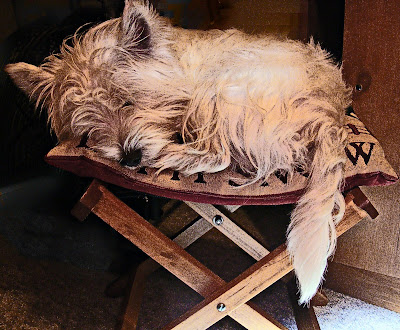
Here is what I did to get the results you will see below.
1. Open the picture and run the auto smart fix (enhance > auto smart fix) . In addition I also ran the auto levels and contrast.
2. Adjust Hue/Saturation (enhance > adjust color > hue/saturation) This picture obviously had too much red in it to me so I chose to adjust just the reds first. Then since it was taken inside under an incandescent light it had that yellowish tint so I also lowered the yellows.
3. Unsharp mask (enhance > unsharp mask) the settings I used were amount: 14, radius: 40, threshold: 0
4. Duplicate layer and convert to black and white (enhance > convert to black and white) My version of pse gives options when you select this. I chose the urban snapshot.
5. Duplicate black and white layer and then go to filter > other > highpass. I chose a radius of 7 pixels.
6. Change the blending mode to hard mix and the opacity to 40 and merge down.
7. Change the blending mode of the top layer to luminosity and merge down.

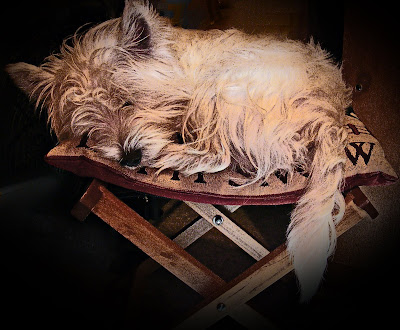
Ahh I like this much better than the original. But, I'm still not quite happy with it. I don't care for the bottom right corner. It's too light in comparison to the rest of the picture. A few more adjustments here.
1. select the elliptical marquee tool. I made a large selection over the picture so that just the 4 corners would be affected.
2. Select > Feather and chose a radius of 200
3. Select > inverse
4. create a new layer then right click the mouse and choose fill layer > black. At this point you can adjust the opacity of this layer if you want or leave it as is and merge down.

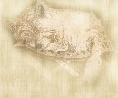
I was very satisfied with the way this looked but felt like doing just a little bit of experimenting. I took a background paper that I had created for a scrap book kit and placed it on a layer beneath the edit. Then I played around with the blending modes. Then I placed a copy of the background paper above the edit and with a soft edge eraser and the opacity turned down to around 25 I erased the inside so that the dog would show through and finally messed around with the blending mode until I got a look that I was happy with.
And VOILA. Here is my masterpiece.


No comments:
Post a Comment