We're almost there. This is the final part of making your handmade journal. Lets get started.
For the cover you are going to need some cardboard, I used plain corrugated cardboard from an old box but any sturdy cardboard will do. I don't know if things like old cereal boxes would be sturdy enough but you could certainly try it. You also need a piece of fabric to cover the board with. If you don't have fabric on hand don't worry. You have to have an old shirt, or pair of jeans or something like that that would otherwise end up in the rag bin or goodwill box.
For the cardboard you will need to cut 2 pieces that are 1/4" wider and 1/2" longer than your inside pages. If you are making the same size as mine then it will be 4 3/4" x 6". You will also need 1 piece for the spine that is the width of your book when it is all stacked together x 6"
The bottom picture above shows the front and back covers and the pages held together. Measure that to get the width of your spine. I know I'm not holding the ruler right but I had the camera on a timer and I was hurrying to set it up to take the picture. The first time I did this I didn't really care for the way the spine ended up feeling so when I did this book I didn't make the spine quite as wide and I think it turned out better. So what I did was to pretty much just go with the width of the pages plus just a fraction more.
Next cut out your fabric so that it is about 1" wider all the way around. My fabric piece was 12" x 8" (I think) sorry I didn't write it down. You are going to want to space your cardboard pieces out so that the space in between is equal to the thickness of the board you are using. I just took a scrap piece of cardboard and used that as a spacer when I laid this out.
Now it's time to glue. I just used cheap dollar store white glue for this part. I also used a foam brush to spread it on so that I had a nice even coverage all over the cardboard.
Just squirt that glue all over and then spread it with the foam brush. Make sure that you are gluing your cardboard to the WRONG side of the fabric
Once all three pieces are glued to your fabric spread some glue on 2 opposite sides and fold the fabric over to adhere it. Then do the other 2 sides. When you are gluing down the last two sides you can fold them in a bit to make more of a mitered corner
Now you are going to glue the pages to the cover. This is another part that I just couldn't get a picture of me actually doing it so I hope that the pictures and my explanation make sense.
In the top picture you'll see that I ran a line of glue down the front and back cover. Then I spread it out a bit. DO NOT GLUE ON THE SPINE.
Next take your inside pages and glue those fabric flaps to the front and back cover centering the pages over the spine.
Above and below a couple different views so you can see how it's positioned. The bottom picture here is the pages being propped up while this dries. I recommend letting this dry completely before moving on.
Last step here. Finally. You need some paper to line the inside of the cover. I recommend using a cardstock weight rather than plain paper. Cut 2 pieces 4 1/2" x 5 1/2" and score down the middle.
Spread your glue all over the back of the liner and you are going to adhere one side to the cover and the other side to the first sheet of paper. I found the easiest way to do this was to put the crease in to the space between the cover and the spine then line it up with the first page of the book. After that was attached then I glued down the other side. Here I used my bone folder to make sure that both sides of the liner were adhered well and to take care of any bubbles or wrinkles that might occur
This very last picture just shows me holding the liner and the first page of the book. Those are going to be glued together.
And there you have it. Your book is done. You can decorate the front if you want or just leave it like that. Now go fill those pages.
I hope that I explained all of this well enough but if not you can always email me with any questions you have.
Showing posts with label tutorial. Show all posts
Showing posts with label tutorial. Show all posts
Wednesday, March 28, 2012
Tuesday, March 27, 2012
Handmade journal tutorial part two
Welcome back and lets get started on part two of how to make a homemade journal.
Yesterday we finished by getting our 4 folios ready.
Today we need to staple those. If you're lucky and have one of those long reach staples this part should be easy. You are simply going to put two staples in the fold of each folio. If you don't have one of those, don't fret because I don't either.
Open your stapler up, lay the fold of your folio on a big eraser and staple through the paper into the eraser. I stapled about a 1/2 to 3/4 of an inch in on each end. When you are done simply bull the eraser off.
Now you can flip it over and bend back the ends of the staples. Don't worry too much if you can't get the staple exactly on the fold. I didn't and it didn't seem to matter. Just get it as close as you can. Also the original directions I followed said to staple from the back to the front but I did it the other way around on this second book and that didn't seem to make a difference either
In the bottom picture above you will notice then when your pages are folded over they are not exactly even. You can leave them like this if you want or you can trim them. I trimmed both of mine and I did it two different ways. The first time I did it with a ruler and a craft knife. You'll need to go slow and make repeated slices through all the layers. The second time I used a guillotine cutter. It's much easier but I wouldn't run out and buy one just for this project if you don't already have one.
Moving right along. Stack your four folded and stapled folios together and get some clips to hold them tightly together. You could also use large paper clips, rubber bands or anything that is going to keep them tight.We are going to be gluing this edge and you don't want any of the glue to seep down in between or your pages are going to be stuck together.
The bottom picture above shows that although the folios aren't real tight against each other I was able to squeeze them together while applying the glue. What kind of glue you ask? You have some choices here. I for one chose to use hot glue only because I tend to be messy with white glue and I knew it wouldn't end well. You could use white glue though just be very careful, maybe applying it with a brush.
You are also going to need a strip of fabric that is the same height at your pages and about 5 times as wide. If you are making the same size book as I did your strip will be 5.5" x roughly 1.5".
Now I just could not figure out a way to photograph applying the glue and adhering the fabric strip because using hot glue you need to work rather quickly. But What you do is apply glue to the bound, folded edges of your folios and center the strip of fabric on the glue. The top and bottom picture show the fabric after it has been glued to the edge from two different angles.
Tomorrow we start on the cover and then finish the book. See ya then
Monday, March 26, 2012
Handmade Journal tutorial
Well I spent the majority of my Saturday working on a tutorial for how to make a handmade journal. Because of the large number of pictures I'm going to break this up in to three separate posts.
This is what we'll be making
OK, so are you ready to get started?
First you are going to need 32 sheets of paper. The type of paper you use is up to you. It can be all the same or a variety, your choice. I decided I wanted lined paper and I also wanted a picture on half of the pages. The first thing I did was to print out my pages. Since I'm going to be cutting my 8 1/2 x 11 paper in half I needed to print the same thing on the top and bottom, front and back. When my pages were printed I cut them all in half. This way instead of needing 32 sheets of paper I only needed 16.
Top picture, the printed pages
Bottom picture, pages cut in half
The next thing you want to do is score and fold all your pages
Now you are going to stack them in to 8 sheet folios. Unfold the pages, stack 8 pages on top of each other and fold them all in half.
I used a bone folder to make nice sharp creases in my folds. It's helpful but not necessary.
Come back tomorrow for part two.
Tuesday, June 21, 2011
Made it
On a beautiful day (when I don't have to go to work) I find it fun to take some of my crafty stuff out on the deck and play.
Recently I took this out with me
When I was done playing I had this.
Just a little experiment that turned into a cute bracelet.
For anyone who crochet's here's how I did it.
I don't recall what size hook I used but it was a small one.
With 3 strands of crochet thread held together chain 45 (more or less depending on the size of your wrist). Then single crochet in each chain across, fasten off and weave in ends.
Attach ring to one end and clasp to the other. Sew a button in the center of bracelet with matching thread and you're done.
Now you've got a brand new cute bracelet for summer. Perfect considering today is the first day of this wonderful season.
Thursday, May 6, 2010
I tried it and I liked it.
I recently found a tutorial for making a photo look like Lomo photography. I really liked the effect so I had to give it a try.
I'm not sure if I got it exactly right but it makes no difference because I sure did like the way it looked when I was done.
I'm not sure if I got it exactly right but it makes no difference because I sure did like the way it looked when I was done.
Aside from following the tutorial as close as I could I also added a texture to it. I wonder what Wade was saying to Duke that he found so interesting. Whatever it is, it looks like Duke is really into it.
Thursday, April 22, 2010
Textures
I always love the way the addition of textures adds to a picture. Ever since I discovered the technique I've been fascinated with it. There are plenty of web sites where you can find free textures, probably just as many who will sell you some or you can make them yourself. Since I'm all about free and do it yourself, making them is right up my alley. I suppose I could just whip up a download and give you some of the ones I've done but instead I'm going to tell you how I went about making my most recent one.
I started by choosing some pictures.
First I opened up the grass picture I showed you the other day.
And there you have it. Of course you could lower the opacity on the texture layer to give it a more subtle look. It all just depends on what you like. So go ahead and pull out some of those pictures you have that you don't think are good for anything and start playing around with them. You just might be surprised at what amazing textures you can come up with.
I started by choosing some pictures.
First I opened up the grass picture I showed you the other day.
Then I went to file>place and chose my second picture
I changed the blending mode on this to hard light and turned the opacity down to about 80%. Then again I went to file>place and chose a third picture
This time I changed the blending mode to hue and left the opacity at 100%. I normally just keep scrolling through the different blending modes until I find something that looks good to me. It's not always the same ones but my favorites seem to be either soft light, overlay and multiply. As you can see this time I didn't use any of those but this is what looked the best this time around. You can also use an eraser to erase parts of a picture that may seem a bit too distracting or don't seem to fit well with the look your going for.
The next step was to merge the layers together. Now I could have left it as is but I chose to do one more thing which was to lower the saturation. You can do that by either hitting cntrl+U on your keyboard or by using a hue/saturation adjustment layer. After all this there was nothing left to do but to save the file.
So lets test it out now and see how it looks on a photo.
I opened up this picture then went to file > place and located the texture I had just made. With the new texture as the second layer I changed it's blending mode to soft light and now the above picture looks like this.
And there you have it. Of course you could lower the opacity on the texture layer to give it a more subtle look. It all just depends on what you like. So go ahead and pull out some of those pictures you have that you don't think are good for anything and start playing around with them. You just might be surprised at what amazing textures you can come up with.
Labels:
digital photography,
photo editing,
textures,
tutorial
Saturday, September 5, 2009
Drop shadows
I had said some time ago that I would do a tutorial on drop shadows and I finally got around to making good on that promise.
You'll have to excuse the horrible screen shots. For some reason I can never get them to look very good. Hopefully you'll be able to get the idea of what I'm talking about here though.
Lets start with why you need them. If you just layer pictures and elements on a background paper all you are going to end up with is a flat image. When you add drop shadows to the layers it gives it some dimension and adds a touch of realism to it.
I'm going to show you two different ways that you can add a drop shadow. (done in photoshop elements 7)
The first is the easiest way, however, it doesn't give you as much flexability.
Make sure that you have selected the layer that you want to add the drop shadow to.
Go to the effects palette and choose layer styles (indicated by the circle at the top of the screen shot) then from the drop down menu choose drop shadows.
For the example I chose the one indicated by the arrow.
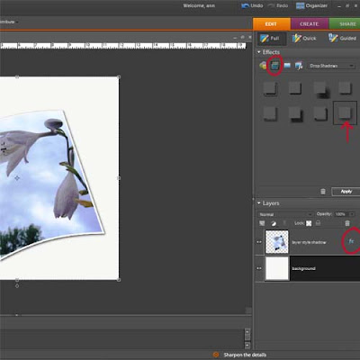
Notice the circle at the bottom of the screen shot. If you double click on that a window will pop up that allows you to adjust the shadow. You will be able to adjust the angle, size, distance, opacity and color. The next picture is what you will end up with.
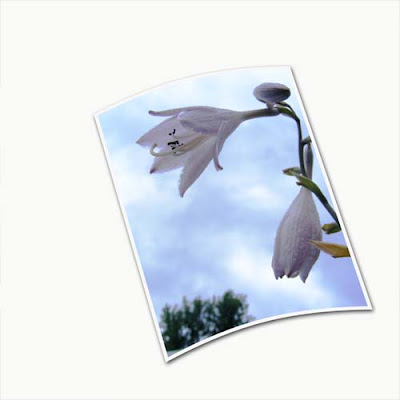
That's not so bad looking, but there's nothing more I can really do with it.
Here is another method that allows you more flexability because it puts the drop shadow of it's own layer.
In the screen shot below notice the red circle. While holding down the control key click your mouse in the area indicated by the circle. This would of course be on the layer of the object you want to add the shadow to. Notice the marching ants around that object now.
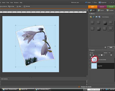
Now that you have the selection loaded add a blank layer below that layer.
Next go to select > feather and enter a value. (I usually choose 10)
Hit the letter D on your keyboard to set the colors to default and with the paint bucket tool selected fill the selection with black on the blank layer. You now have a drop shadow below your object.
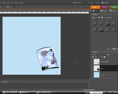 (I should mention here that the picture in the screen shot wasn't how it looked at first. I played with it a little and forgot to leave it the way it originally looked. OOPS)
This is what you can do with you drop shadow now.
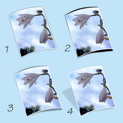
Image 1 is how it will look if you follow all the above steps. It pretty much looks about the same as it did using the first method.
You'll have to excuse the horrible screen shots. For some reason I can never get them to look very good. Hopefully you'll be able to get the idea of what I'm talking about here though.
Lets start with why you need them. If you just layer pictures and elements on a background paper all you are going to end up with is a flat image. When you add drop shadows to the layers it gives it some dimension and adds a touch of realism to it.
I'm going to show you two different ways that you can add a drop shadow. (done in photoshop elements 7)
The first is the easiest way, however, it doesn't give you as much flexability.
Make sure that you have selected the layer that you want to add the drop shadow to.
Go to the effects palette and choose layer styles (indicated by the circle at the top of the screen shot) then from the drop down menu choose drop shadows.
For the example I chose the one indicated by the arrow.

Notice the circle at the bottom of the screen shot. If you double click on that a window will pop up that allows you to adjust the shadow. You will be able to adjust the angle, size, distance, opacity and color. The next picture is what you will end up with.

That's not so bad looking, but there's nothing more I can really do with it.
Here is another method that allows you more flexability because it puts the drop shadow of it's own layer.
In the screen shot below notice the red circle. While holding down the control key click your mouse in the area indicated by the circle. This would of course be on the layer of the object you want to add the shadow to. Notice the marching ants around that object now.

Now that you have the selection loaded add a blank layer below that layer.
Next go to select > feather and enter a value. (I usually choose 10)
Hit the letter D on your keyboard to set the colors to default and with the paint bucket tool selected fill the selection with black on the blank layer. You now have a drop shadow below your object.
 (I should mention here that the picture in the screen shot wasn't how it looked at first. I played with it a little and forgot to leave it the way it originally looked. OOPS)
This is what you can do with you drop shadow now.

Image 1 is how it will look if you follow all the above steps. It pretty much looks about the same as it did using the first method.
Image 2 I used the smudge tool to drag the shadow out slightly
Image 3 this is the same as 2 but with a lowered opacity. I think I took it down to about 25%
Image 4 For this one while holding down the control key I dragged the corners of the shadow out which gave it the appearance of being farther away from the background page.
Now that you know how to do it, go out and cast some shadows.
Labels:
digital scrapbooking,
drop shadows,
photo editing,
tutorial
Sunday, August 23, 2009
Per request part 2
This post will cover how I did the pencil sketch photo for the layout. There are actually a few different ways to do this, in this case I chose the easiest...lol
1)first open the picture you want to apply the effect to
2) duplicate your picture.
3) In the effects palette choose photo effects (circled in red in the screen shot) then pencil sketch (indicated by the red arrow)
If you like the way it looks you can leave it at this. However, this is usually too light for me so I duplicated the pencil sketch layer, changed the blending mode to multiply then merged down. With some pictures I have done this step more than once, it just depends on the picture you are working with.
4) Now you should have your original photo, a duplicated layer and the pencil sketch layer. You can leave the pencil sketch layer as is or play around with different blending modes to get different looks. In my case I changed the blending mode to lighter color and then merged the sketch layer down to the color copy. You may want to try changing the blending mode to screen to add just a hint of color to the sketch.
5) At this point you can merge all your layers then save. (If you want to retain your original image be sure to save the file with a different name)
Hope you enjoyed my little tutorials today but mostly I hope they made sense....lol
Per request part 1
By request I'm going to attempt to explain how I did this layout.
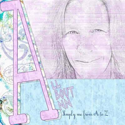
Sorry no screen shots with this but I always seem to have a hard time doing those. I know how but get frustrated trying to get them right....lol
1) I started with a blank canvas in photoshop elements sized at 12x12 (3600px x 3600px) resolution 300 (as a side note when I resize to post here I size the canvas at 500px x 500px with a resolution of 72)
2) I added my background paper which was the pinkish purplish colored paper
3) I then layered on a second paper (the blue one) Since I didn't want it to cover the entire canvas I used the rectangular marquee tool to select the top portion of the paer and then hit delete, leaving only the bottom part of the paper showing.
4) A third paper was added on top of that (in this case, the paisley paper). I left this covering the entire canvas for the time being.
5) With the type tool, I typed the letter A, choosing a font that suited my taste, then resized the letter to span the entire page top to bottom. Once I was satisfied I simplified the layer.
6) My next step, to make the letter stand out a bit more was to add a stroke outline to the letter.
There are 2 ways you can do this
a) you can go to Edit > stroke outline > then enter the size, color, and placement of the outline.
OR
b) control + click on the thumbnail in the layers palette which will load the selection of the layer. Add a new blank layer above and then repeat the same procedure as above. This way you have your outline separated from the actual letter and you can then add a bevel, texture or whatever you choose. (this is the method I prefer to use most of the time). When you are satisfied with the outline you can then merge the layer down.
7) Now to cut away part of that paisley paper. On the letter layer, using the magic wand tool, I clicked on the canvas to the right of the letter which selected only that part of the canvas. Move to the paisley paper layer and hit the delete key to remove that portion of the paper. I then went back to the letter layer and moved it slightly to the left.
8) I wanted my letter to match my background paper. I duplicated layer 1 (the background paper) and moved it above the letter layer. I then hit control + G to clip the paper to the letter, then control + E to merge it down.
9) Finally I added my photo. I used a soft edge eraser with a lowered opacity of about 40-50 and erased around the edged of the photo to make it blend in better. I also erased lightly inside the photo to get rid of some of the harsh lines since it was a pencil sketch. Finally I lowered the opacity of the photo until I liked the way it looked.
I didn't include in the tutorial about adding drop shadows, but I did add those to the layout as well. Maybe how I do drop shadows will be a whole other tutorial.
If you want to know how I did the pencil sketch I'll add another post "Per request part 2"
Tuesday, June 23, 2009
It's so hard to stay motivated
The last couple of days I have had to force myself to do the exercises that I learned when I was going to physical therapy. I've been feeling pretty good so the other day I decided to just skip them for the day. WRONG choice. It wasn't horrible but I sure was a lot stiffer than I have been. So yesterday, even though I was dead tired, I forced myself to get it together and exercise. Today, again I thought about just skipping them but told myself that I just can't do it. I think I need a drill Sergeant standing over me. The reward for doing them certainly is worth it but it would be icing of the cake if it would just do a little more for me, like maybe shrinking my butt a bit.
Oh well, enough about that. This is the picture I was going to post about the other day.

I found this tutorial called "Powder pastels" I like how soft it makes the picture look.

After I was done I added an extra little touch to it. I can never seem to stop where I'm supposed to. I used the paint daubs filter on it and it really made the picture pop.

Other than my weekly cafe mom challenges I haven't been doing too much in the way of creating new things, so I don't have anything to give you today. I have a three day weekend coming up though so maybe before it's over I'll come up with something.
Oh well, enough about that. This is the picture I was going to post about the other day.

I found this tutorial called "Powder pastels" I like how soft it makes the picture look.

After I was done I added an extra little touch to it. I can never seem to stop where I'm supposed to. I used the paint daubs filter on it and it really made the picture pop.

Other than my weekly cafe mom challenges I haven't been doing too much in the way of creating new things, so I don't have anything to give you today. I have a three day weekend coming up though so maybe before it's over I'll come up with something.
Friday, June 19, 2009
Are you silly?
Don't ever let anyone tell you that silliness and playing is just for kids. I strongly believe that holding on to your inner child is what keeps you young and happy. I personally bring out the inner child frequently. Of course sometimes it's to throw a temper tantrum but that's another story...lol.
My inner child likes to draw, and I don't care if it's good, bad, colored inside the lines, or even recognizable. My inner child also likes to fabricate stories, because I really don't like drawing all that much, I do stink at it. BUT, I did have fun with a tutorial I found to make a picture into a cartoon drawing. I did this one real quick just to try it out so it's not that great, but like I said it was a lot of fun. I got a little carried away with the burn tool but I was real careful not to draw in all the wrinkles on my face...lol

I also did a little playing around a did a layout of my all time favorite aunt. This was a very old picture of my Aunt Mary. There are so many wonderful stories I could tell you about this woman but I won't bore you with all of those. She sure was something special though.

I also put together a mini kit for you. In the kit you'll find everything I used in my layout plus a quick page. I couldn't think of a name so I just went with Mary since that's who the layout was about.
My inner child likes to draw, and I don't care if it's good, bad, colored inside the lines, or even recognizable. My inner child also likes to fabricate stories, because I really don't like drawing all that much, I do stink at it. BUT, I did have fun with a tutorial I found to make a picture into a cartoon drawing. I did this one real quick just to try it out so it's not that great, but like I said it was a lot of fun. I got a little carried away with the burn tool but I was real careful not to draw in all the wrinkles on my face...lol

I also did a little playing around a did a layout of my all time favorite aunt. This was a very old picture of my Aunt Mary. There are so many wonderful stories I could tell you about this woman but I won't bore you with all of those. She sure was something special though.

I also put together a mini kit for you. In the kit you'll find everything I used in my layout plus a quick page. I couldn't think of a name so I just went with Mary since that's who the layout was about.
You can get the download HERE
Don't forget that Sunday is Father's Day. If you need something for Dad I posted a Father's Day word art freebie a few posts back.
Have a great weekend and see ya next time.
Labels:
digital scrapbooking,
freebie,
kits,
links,
LO,
photo editing,
quick pages,
tutorial
Sunday, May 3, 2009
This, that and the other thing
Just a little bit of this, that and the other thing today.
I'm discovering right at this moment that there are sometimes two ways of doing things. Did you know that instead of using the backspace key when you make a typing error you can also use the delete key? It takes a little more effort but it works just as well. Why would I want to do it that way? Well I don't really WANT to. It's more out of necessity. Apparently my keyboard did not appreciate the cup of coffee that I gave it this morning and now it's getting it's revenge on me. Every time I hit the backspace key I get a number five. I can't even type that number because instead it shows as b5. It's also playing funny games with the control key as well as a few of the other numbers. Thankfully, I can still use most of the keys to type. A trip to the electronics department at Walmart may be in order.
The last few days I've been playing around with Dazzling Reflections quite a bit. Every now and then they offer a free template to go with the program. Just the other day I got their free tulip template and made this.
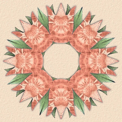
Then using the kaleidoscope I made this layout.
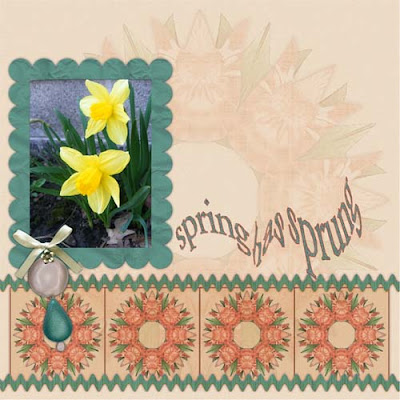
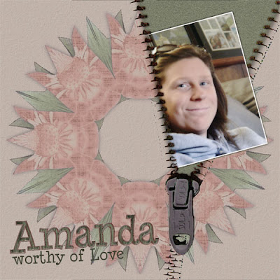
and then this one. So tell me what you think of the zipper effect that I did? I really hope you like it because I'm offering it as a freebie today. Along with the freebie there is also a tutorial to show you how I made this layout.
So here is what you get. This is just the template that I made and used to do the layout.
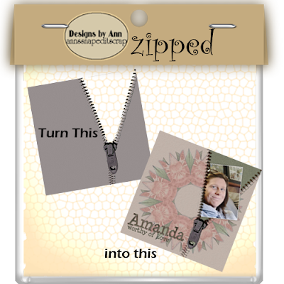
You can get this freebie by clicking HERE
Now if you want to know how I used it keep reading because next is my tutorial.
Next you will want to add a patterned paper. You can do this by either opening it up in a seperate document and then dragging it up into your canvas or by going to file > place. Now you want to hit control + G to link the two layers and clip the paper to the template.
I'm discovering right at this moment that there are sometimes two ways of doing things. Did you know that instead of using the backspace key when you make a typing error you can also use the delete key? It takes a little more effort but it works just as well. Why would I want to do it that way? Well I don't really WANT to. It's more out of necessity. Apparently my keyboard did not appreciate the cup of coffee that I gave it this morning and now it's getting it's revenge on me. Every time I hit the backspace key I get a number five. I can't even type that number because instead it shows as b5. It's also playing funny games with the control key as well as a few of the other numbers. Thankfully, I can still use most of the keys to type. A trip to the electronics department at Walmart may be in order.
The last few days I've been playing around with Dazzling Reflections quite a bit. Every now and then they offer a free template to go with the program. Just the other day I got their free tulip template and made this.

Then using the kaleidoscope I made this layout.

and then this one. So tell me what you think of the zipper effect that I did? I really hope you like it because I'm offering it as a freebie today. Along with the freebie there is also a tutorial to show you how I made this layout.

So here is what you get. This is just the template that I made and used to do the layout.

You can get this freebie by clicking HERE
Now if you want to know how I used it keep reading because next is my tutorial.
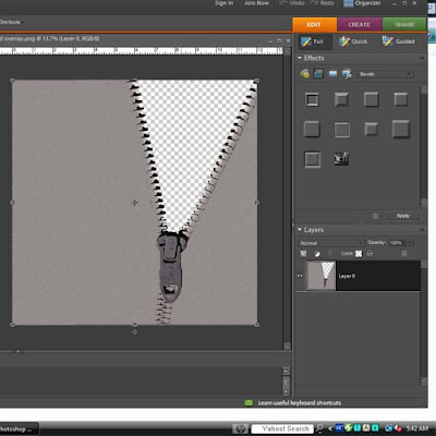
First of all open the zipped template.

Next you will want to add a patterned paper. You can do this by either opening it up in a seperate document and then dragging it up into your canvas or by going to file > place. Now you want to hit control + G to link the two layers and clip the paper to the template.
5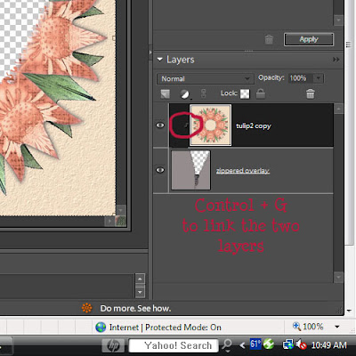
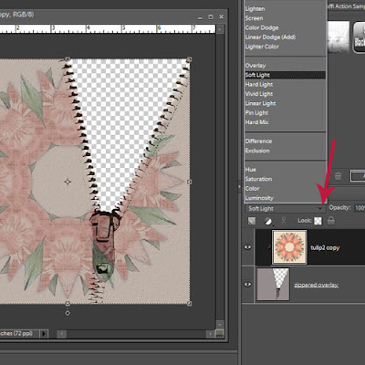
Next play around with the different blending modes until you get a look you like. I used soft light in my example.
Before merging the two layers, on the top layer (patterned paper) I erased the part over the zipper pull because I really didn't like the way it looked, and I just wanted the gray zipper pull to show.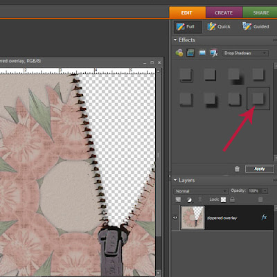
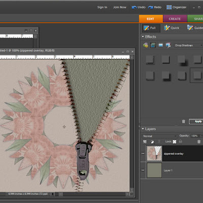
Now you are going to add another paper or solid colored layer and move it below the zipped layer. Here I chose a color from the kaleidoscope and then added texture to it.
Now add a picture. Do any editing you want to the picture now. I simply added a stroke outline to this one in white. I also added a drop shadow to the picture before going any further. Make sure that you have your picture between the other two layers. Position the picture where you want it. Now to load the selection of the picture, while holding down the control key, click on the picture in the layer palette. You'll see the marching ants around your picture. In the screen shot below I have a red arrow pointing to where you should click to make the selection.

Next play around with the different blending modes until you get a look you like. I used soft light in my example.

Before merging the two layers, on the top layer (patterned paper) I erased the part over the zipper pull because I really didn't like the way it looked, and I just wanted the gray zipper pull to show.
Once you are happy with the way it looks you can merge the two layers
Next you will want to add a drop shadow. The red arrow indicates the choice for shadow that I used. When you are happy with the way your drop shadow looks you can simplify the layer.
Next you will want to add a drop shadow. The red arrow indicates the choice for shadow that I used. When you are happy with the way your drop shadow looks you can simplify the layer.

Now you are going to add another paper or solid colored layer and move it below the zipped layer. Here I chose a color from the kaleidoscope and then added texture to it.

Now add a picture. Do any editing you want to the picture now. I simply added a stroke outline to this one in white. I also added a drop shadow to the picture before going any further. Make sure that you have your picture between the other two layers. Position the picture where you want it. Now to load the selection of the picture, while holding down the control key, click on the picture in the layer palette. You'll see the marching ants around your picture. In the screen shot below I have a red arrow pointing to where you should click to make the selection.
Subscribe to:
Posts (Atom)


