Sorry no screen shots with this but I always seem to have a hard time doing those. I know how but get frustrated trying to get them right....lol
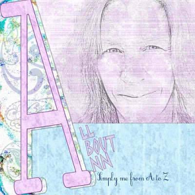
1) I started with a blank canvas in photoshop elements sized at 12x12 (3600px x 3600px) resolution 300 (as a side note when I resize to post here I size the canvas at 500px x 500px with a resolution of 72)
2) I added my background paper which was the pinkish purplish colored paper
3) I then layered on a second paper (the blue one) Since I didn't want it to cover the entire canvas I used the rectangular marquee tool to select the top portion of the paer and then hit delete, leaving only the bottom part of the paper showing.
4) A third paper was added on top of that (in this case, the paisley paper). I left this covering the entire canvas for the time being.
5) With the type tool, I typed the letter A, choosing a font that suited my taste, then resized the letter to span the entire page top to bottom. Once I was satisfied I simplified the layer.
6) My next step, to make the letter stand out a bit more was to add a stroke outline to the letter.
There are 2 ways you can do this
a) you can go to Edit > stroke outline > then enter the size, color, and placement of the outline.
OR
b) control + click on the thumbnail in the layers palette which will load the selection of the layer. Add a new blank layer above and then repeat the same procedure as above. This way you have your outline separated from the actual letter and you can then add a bevel, texture or whatever you choose. (this is the method I prefer to use most of the time). When you are satisfied with the outline you can then merge the layer down.
7) Now to cut away part of that paisley paper. On the letter layer, using the magic wand tool, I clicked on the canvas to the right of the letter which selected only that part of the canvas. Move to the paisley paper layer and hit the delete key to remove that portion of the paper. I then went back to the letter layer and moved it slightly to the left.
8) I wanted my letter to match my background paper. I duplicated layer 1 (the background paper) and moved it above the letter layer. I then hit control + G to clip the paper to the letter, then control + E to merge it down.
9) Finally I added my photo. I used a soft edge eraser with a lowered opacity of about 40-50 and erased around the edged of the photo to make it blend in better. I also erased lightly inside the photo to get rid of some of the harsh lines since it was a pencil sketch. Finally I lowered the opacity of the photo until I liked the way it looked.
I didn't include in the tutorial about adding drop shadows, but I did add those to the layout as well. Maybe how I do drop shadows will be a whole other tutorial.
If you want to know how I did the pencil sketch I'll add another post "Per request part 2"

2 comments:
this was an awesome tut! i am going to have to start playing around with my photoshop again. i only have photoshop7 so maybe there's some things that i won't be able to do. i just like playing around with it though. i think i have figured out that layering is the key, right?
Thanks PJ glad you liked it. I use photoshop elements 7 so you may be able to do everything I did here. Yep it's all about layers.
Post a Comment